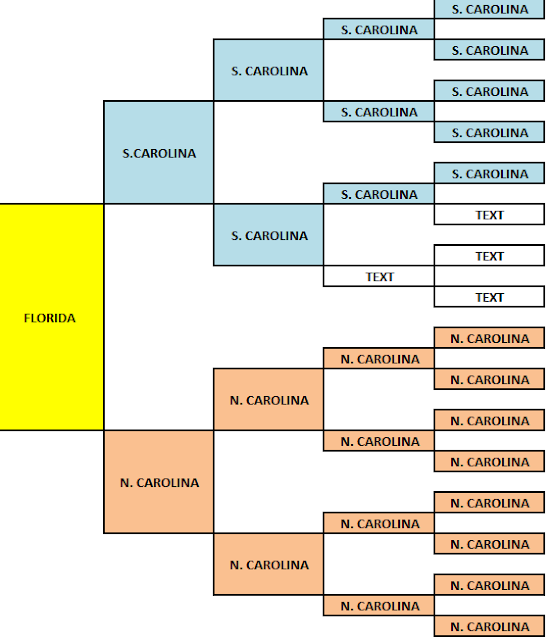
The Little Pedigree Chart That Went Viral
Last week my fellow blogger, J. Paul Hawthorne of GeneaSpy, created a colorful birthplace pedigree chart using Microsoft Excel. He then posted his chart on Facebook and from there it exploded on not only Facebook but Instagram, Twitter, Google+ and probably every genealogy blog that is currently active.
I am a little late to the party with my chart but better late than never as the saying goes! This is my bio-genetic family birthplace chart. As you can see it is not very colorful because I apparently have very strong genetic roots to both North and South Carolina. Thank you, J. Paul Hawthorne on a fun exercise! #MyColorfulAncestry


No comments:
Post a Comment